Thursday 25 September 2014

PARC Design Methods


Design Methods in Elementary

With grades two and three this year we've been looking at what makes something "good".  We've focused on pictures, videos and blogs (a lot in a short time, but we are far from finished) and how we can make our current things better. 

Last year I did a similar unit on digital design where I've changed CRAP to PARC (lots of other COETAILers have used CARP, I don't know, the francophile in my loves the the park). I made a quick slideshow (which thankfully I don't have anymore, so I can't show you) about what these methods are, and how to use them.  It was an ugly presentation created on powerpoint that was very functional, but not very beautiful. 

I've tried this year to focus on bringing a simpler version to the new school. Drawing from the Presentation Zen (I wonder why they didn't do pre-Zen-tation, anyway) I looked at the less is more kind of idea.  Using a strong image and the concept of the slide I wanted to make connections between the word and the image. 

I used the same image twice. In my presentation I'm going to ask the students what makes the first image powerful, and then we move to the second slide with the word and talk about what the word might mean, and then we move on. 

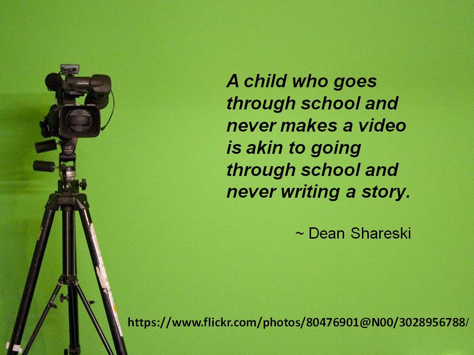
The quotation took me forever to find, I wanted to find something interesting, but something elementary school students (from as young as 3) could understand. I wanted to get the idea that creation was important. Since it is important, we need to think about why and how we create.  By using principles (not rules, I wonder if I should change it to ideas) of PARC we can create more useful images. 

When I did this last year (with a substandard presentation) the students really got the idea and applied it to their google slide presentations, and power point presentations. 

Blogs are a big push this year at our school for the grade 3s.  We've been setting up the lessons and all the students have been playing around with colour (which is going to be my next presentation revision) and I'm trying to help them understand why purposeful creation to engage the audience is so important.  

I think images can focus young learners, and build on their understanding to use the new vocabulary more effectively.  This is going to be a reflective process throughout the year, and I am going to add a colour presentation (to hopefully get rid of all the random rainbows).  I think that by starting with what you make is important (and surrounded by white space) students will start to think more deeply about their digital design creations. 


Thursday 18 September 2014

Word Choice for Blogging

Attribution Some rights reserved by 2,000,000+ views Thank You!
I looked for pictures for a couple of hours, wondering what to use to engage my grade 3 students who are thinking about blogging.  I ended up choosing the above image for the word choice and colours because we were doing a blogging lesson.

Usually when I do anything on google drive, or blogs with the students the first thing they want to do is change the colour.  I used the different choices in this image to discuss why we should use colour and which colours we should use.  I started off asking the feelings behind the colours in the image, the colours we had right away, then we talked about the choices that were in our flipboard readings. 

The students still continued to use colour in their writing, but they were better able to describe why they chose that particular colour. 

When thinking about learning blog posts, I wanted the students to get away from the idea that they should be something like "This week I learned about the digestive system".  First we practiced on google docs about how to create interesting blog posts, we "commented" on each others doc to create discussions and move towards a dialogue of learning, rather than just writing what we learned.  Our focus was to create a community, and with this in mind, our word choice was an important tool to engage our audience. 

Students thought narrowed down their words and focused on what would be engaging for their reader, as well as offer a way to comment on their posts to create a discussion.  

It was our first attempt and  nothing was too spectacular but it was a great way to start the idea of blogging.  

While I often use images (especially images without words) this weeks assignment was interesting because of how much I thought about which image to choose.


Wednesday 10 September 2014

Design thinking


I've really been looking forward to this course. Digital design is something I've been thinking a lot about, but really need a chance to apply it and get feedback.


I'm not the biggest fan of electronic music, but I recently bought the Daft Punk album Random Access Memory.  While listening to music, at times, I think about the design behind it.  This song in particular really flows well for me, I can follow the progression, and even though I don't like every aspect of this song, I know why and how they all fit in.  The whole song seems very purposeful. It also tells a story, sometimes with words, sometimes with beat, sometimes with other tones. I understand (somewhat) the construction behind it. This course on digital design seemed to relate well to my thoughts on this blog. 

Part of the reason I created my personal blog, instead of my Coetail blog was I could change the actual layout of the blog. I had more options and more opportunities to create something more personal. I like how I can change the background, I have more influence over how wide my reading space is, I can change the labels easily and just totally customize it (if I want to).  I found the Coetail blog a little too limiting. 

Personal Blog

I chose clouds for both because it makes me feel at peace. I chose lots of white and blue and grey on both blogs for the calm feeling. I wanted to create a place for thought and relaxation. Something comforting. It also matches the background to my twitter page, which creates a sense of continuity. 

Coetail Blog

I realise there's a lot more to do with the creation, and during this course I hope to make some more changes.  Right now I feel comfortable with the design of my blog, but I've spent a lot of time thinking about it when I first started it. In the future, I think I'm going to change my header to make it a little more readable, and look more closely at the widgets to make sure that's how I want everything organised. 

Last year I taught a lot about digital design with the young ones. Instead of CRAP design I changed it to PARC, just to solve a lot of laughing issues.  We talked extensively about the colour wheel, typography and the types of decisions designers made, and thankfully I noticed a huge difference in their slide presentations. 

So far this year I've talked about the importance of colour with my grade 3 students. We are using Google docs and i want them to think about how to engage their audience (or seriously disengage their audience) by choosing different colours.  It's a slow start, but we are thinking about it. 

I thought the Visual Literacy blog could've used a design re-haul as well.  I've been thinking a lot about how Nicki needs more free reign in this course and how great it would be to understand "art" as much as she does (just slightly jealous). 


Friday 5 September 2014

Sharing ideas through video

This has been an incredibly busy week, but I am trying to focus on making one blog post a week and this week I've been thinking a lot about training, and sharing and how amazing video is at this.

Attribution Some rights reserved by Brian Metcalfe
This week I've created two videos for training purposes for my teachers.  Recently I've had to go to four or five classes and set certain things up.  While I love spending my time with teachers, I really want my job as EdTech Coach to be focused on learning conversations.  In order to liberate some of my setting up with teachers time I've made videos and shared them with teachers, this way they always have access and they can learn at their own time (and not have to ask me which I think some people try to just coast along until we realize that they aren't doing what's expected).  The videos have been easy to make using Camtasia2 my coworkers use another program, but I think this is pretty easy to use. 

I've been in a number of classes this week working with students making videos.  I just returned from one class that is working on documenting the systems they use.  The students take a video of the system they want to talk about and then use Explain Everything to narrate. 

The quotation above is great, we need students to be making videos (especially the younger students) to fully understand what they know and honour how they can explain it.  It empowers the students to share their knowledge in any way possible. 

This week in the #enviroed chat we've been talking about nature and technology and Ranger Ridley led me to this link regarding crowd sourcing natural understandings. It's amazing how videos (and photos) can lead others to see what new natural things are occurring, and what is happening to our natural systems. 

My focus on the next couple of weeks will be bringing video into more of my lessons, and hopefully in more of my teacher professional development.